
An offer for mentorship and the quest for a better email client
Hello,
I’m Johannes Schardt and you are reading the 9 Ambitions newsletter. This month: more thoughts on racism, a mentorship offer, a new email service and a few links for you to explore.
As I mentioned in the last issue, I was stumped and caught off-guard by the recent events in the US. Realizing that I lacked a true understanding of racism, I started to educate myself, become more aware of the problem and consider my role as a white person within this highly complex social dynamic.
“You can’t be neutral on a moving train”, historian and civil rights activist Howard Zinn said. Events are already moving in certain directions, and to be neutral means to accept that. What can I do to nudge that train in the right direction?
Offering my experience to younger designers is something I thought about for quite a while, but so far, I haven’t done much about it. I never went to college, so teaching is a long shot and something I’m not that interested in yet. Mentoring someone who just started her or his career, however, feels right.
If I would just proceed with my ambition in mentoring – if I would be “neutral” about it – I would probably end up with a white, male mentee (statistics and in-group bias being the reasons for my prediction).
But our industry – whose output greatly affects people and society as a whole – already has a severe diversity problem.
Looking at it through an anti-racist lens, passing on my experience to just white people would consolidate white supremacy.
To counter that, to not just sit on the train and watching it move in the wrong direction, here’s my first, little attempt to do better:
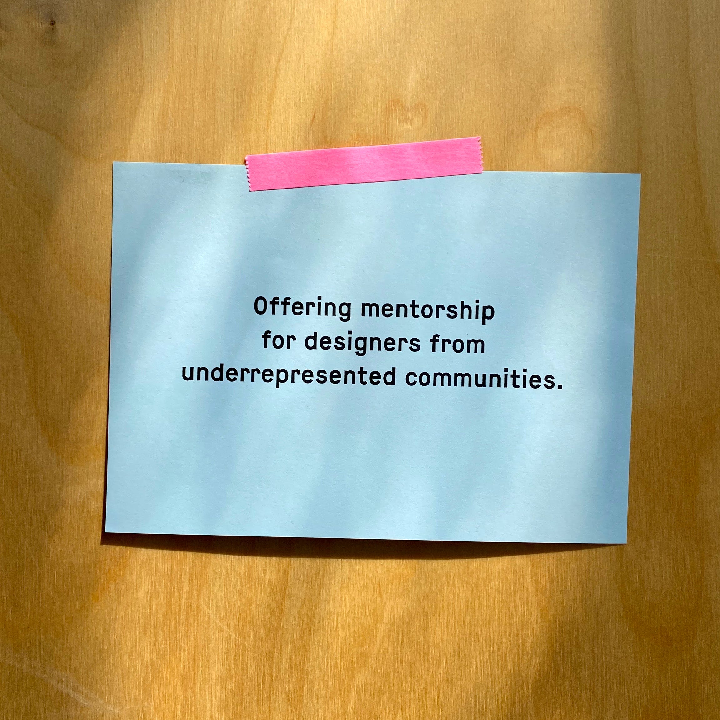
Mentorship offer
After working more than 20 years in the field of design, I learned a thing or two. I’d love to pass along that experience, expertise and social capital to the next generation.
If you…
are a designer (UI/UX, IXD etc) with around 1-3 years of professional experience
belong to an underrepresented community
like to pick other brains
… I’d like to hear from you. Let’s meet (in Hamburg or Zoom) for an hour and talk about design. If we both feel that this is helpful, we’ll continue.
If you know someone who fits the bill or know someone who might know someone who meets the criteria, please forward this email or share it.
Hey. Bye.
It seems everybody is complaining about email. But since a lot of back and forth communication moved to Slack and the like, I have a very relaxed relationship with my inbox. And email-newsletters are great, aren’t they?
Still, I’ve been looking for a better email client for years. Every now and then I check out a shiny new app, but nothing was enticing enough to make the switch from old Apple Mail. Which is mediocre, but at least it’s not going to be sold or sunsetted (remember Inbox or Mailbox?).
37 Signals / Basecamp started around the time when I began my career in design. I always respected them, because they had attitude (even though it can be pretty annoying sometimes). So when I found out that the guys who spent two decades building Basecamp (a software which aims to replace email in a project context) released a new email service, I was all ears.
What I gathered from the website and saw in the demo video was enough to sign up for a hey.com address and install the software on my Mac and iPhone right away. Finally someone was really rethinking the way to work with emails and not just building a slicker interface (although a slicker interface would have… Wait, I’m getting ahead of myself).
I’m not going to explain all the features, you can check them out yourself. One of the most intriguing for me was Reply & Focus and Set Aside, because that’s what I’m already doing in Apple Mail with a little hack (more on that later). Also the concept of screening your emails seemed interesting.
Alas, I must report that half-way in the 14-day trial, I stopped using it.
Colors vs. Words
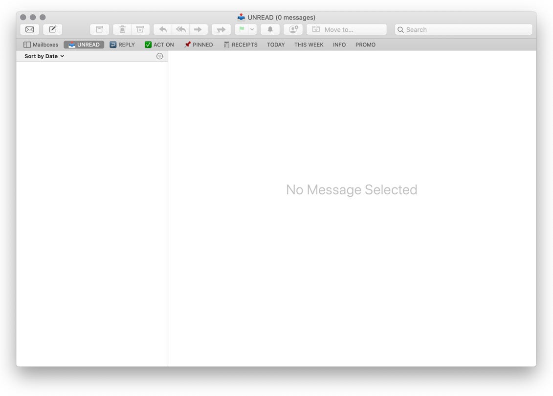
The biggest deal breaker was the UI. While the overall aesthetic doesn’t appeal to me, I could have condoned it. But while using the app for a few days, other problems beyond mere look became apparent. In the Imbox (not a typo) I found it hard to focus on the emails. Look at this:

I’m sure the heavy use of color was not done to just “look different”. The argument for the colored circles, I guess, is to differentiate between senders at a glance and maybe even associate a color with a person. But to me it was just randomly colored shapes that popped out so much, that it distracted me from the subject and sender’s name, which is the essential information in this view (The initials in circles can be replaced with images, but somehow that didn’t make it into my top priorities for the week).
Switching back to my old email app felt like a relief. There was just text. Black and grey on white. This could be mere-exposure in full effect. But I would still argue that the use of color in this case does more harm than good.
One of the product designers wrote on the company’s blog: “Always choosing clarity over being slick or fancy. Internally we call this ‘Fisher Price’ design.” Well, I can definitely see Fisher Price in the design, though I miss clarity.
Inbox Zero vs. Screening
I often say I don't have a lot of regrets in life, but if I have one, it's been from the attention wasted chasing inbox zero in a traditional email client for years. Inbox zero is tyranny when everyone has direct access to write you about anything at any time.
This is a tweet from Basecamp founder David Heinemeier Hansson. While I can totally sympathize with that sentiment, his team has implemented something which has a similar effect as inbox zero: The Screener.
The Screener is a page where all the emails from first time senders arrive. There you have to decide if you want to see emails from this address and if so, whether they should be routed to your Imbox or other predefined buckets.
The screener is not the default view. When you open HEY, you are in your Imbox. But if there are unscreened emails, a prominent cyan colored button at the top makes sure you can’t ignore it. Again, the choice of color (as well as size and position) of this UI element is highly questionable. If the Imbox is the place where I receive my important emails – the ones which are of interest to me, the ones I want to focus on – why is this cyan rectangle screaming at me? “SCREEN YOUR EMAILS! NOW!” Instead of Inbox Zero, I have to do Screener Zero.
After a few days, I gradually fell behind screening my emails and when the number in that tyrannic cyan button went north of 50, I gave up.

To be fair, you only have to screen every email address once. But it feels like unnecessary work to me, because I never suffered from a bloated inbox. I don’t get much unwanted emails, at least not repeatedly.
There’s another problem with the concept of The Screener. Your decision is tied to an email address. But companies and people often don’t use different email addresses for different types of emails. Let’s say you get a newsletter from info@example.com. You sort it to The Feed (the predefined bucket for newsletters), where future emails from this address will end up along with all the other 119 newsletters you subscribed to. But if info@example.com wants to let you know that their database was breached, that email also goes straight into that bucket, where the signal is drowned out by noise (yes, pun intended).
Split vs. Feed
Also greatly missed: a split view. Instead, HEY gives you an option to read your emails together in a newsfeed-like view. Might sound like a good idea in theory, but it turns out pretty annoying. Because if there is a very long email in your feed, you scroll and scroll and scroll… and there is no way to just skip to the next one (at least I didn’t find one). In a split view on Apple Mail for Mac, I just use the arrow keys to switch between emails and the trackpad to scroll through a selected email. If I don’t want to read the whole thing, I just select the next one by hitting a key. This is way faster and comfortable than going back and forth between overview and detail view or reading them in a feed.
_
I really appreciate the effort to question and rethink the workflows around emails and I also see a lot of great ideas in HEY. But unfortunately some of the solutions they came up with don’t convince me at all. Í wish they would.
So I’m back to Apple Mail. It’s by no means perfect, but with a few adjustments (on the desktop version) it works for me. This is how it currently looks:
I mentioned above that I’m going to explain my little workarounds. But this email took me way longer to write than I expected. So this ends with a cliff hanger. Sorry, you have to wait for the next episode.
More to read
(Let Us Out of This Clause)
You might have realized that I use parentheses and em dashs quite often. If you do too (or if you hate it when writes do it), you’ll enjoy this op-ed by Ben Dolnick.
Menus, Metaphors and Materials: Milestones of User Interface Design
They should have chosen one of the interfaces we did for Native Instruments instead of Reason, but still an interesting collection ;)
precious weeknotes
More ramblings from yours truly.
Thanks for reading.
Until next month,
Johannes